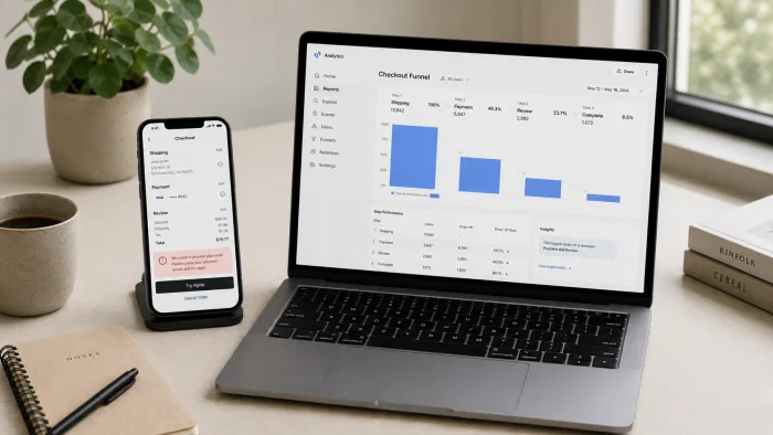
There is a version of your product that works perfectly. The features are built. The flows are connected. Every screen renders correctly on every device. You have tested it yourself and it makes sense to you.
And users are still leaving.
Not because your product does not work. Because it does not communicate clearly enough for someone who is encountering it for the first time, under real conditions, with divided attention and no patience for confusion. The product works. The design is failing them, quietly, in ways that do not show up as errors and do not trigger support tickets. They just leave.
This is the most expensive kind of design problem because it is invisible until you look for it specifically. It does not announce itself as a design failure. It announces itself as a conversion rate that is lower than it should be, a retention number that does not reflect the quality of the product, a user acquisition cost that keeps climbing because you are filling a leaking bucket rather than fixing the leak.
This post is about what those failures look like in practice, why they are so easy to miss, and what it takes to fix them before they cost you another month of users who could have stayed.
Design problems do not announce themselves as design problems. They announce themselves as low conversion, poor retention, and users who churn after a single session without leaving a reason.
WHY GOOD PRODUCTS HAVE BAD DESIGN
The most common reason is that the people who built the product know it too well to see it clearly.
When you have been working on a product for months, every screen makes intuitive sense. You know what the button does. You know where to find the settings. You know that the empty state means you need to create something first. That knowledge is so deeply embedded that it is impossible to unknow it when you test the product yourself.
Your users do not have that knowledge. They arrive at your product with no context, a low tolerance for confusion, and a competing option one tap away. Every moment of uncertainty is a moment where they are deciding whether to push through or leave. Most of them leave without telling you why.
The second reason is that design quality is usually evaluated visually rather than functionally. Does it look good? Does it feel modern? Is the colour scheme consistent? These are valid questions but they are the wrong primary measure. The right primary measure is: does a user who has never seen this product before know what to do within the first ten seconds? Everything else is secondary to that.
THE DESIGN FAILURES THAT COST YOU THE MOST
No clear primary action
Every screen in your product should have one thing it is primarily asking the user to do. One button, one link, one action that is visually dominant and immediately obvious. When a screen has three buttons of equal size and equal visual weight, the user does not see three choices. They see a decision they have to make before they can proceed, and many of them will not make it.
A common version of this failure: an onboarding screen that asks the user to connect an integration, invite a team member, or complete their profile, presented as three equally prominent options. The user came to use the product, not to manage their account setup. The right design leads them to the value first and surfaces the setup options progressively. The wrong design stalls them at the threshold and calls it onboarding.
Forms that ask for too much too early
Every field you add to a form is a question you are asking the user to answer before they have received any value from your product. Early in a user journey, before trust is established, before the user has experienced what your product does for them, that question has a cost. The longer the form, the higher the cost, and the more users abandon before completing it.
A registration form that asks for name, email, password, company name, company size, role, and phone number is not collecting useful data. It is filtering out users who are not willing to invest that much before seeing anything. Most of them are not unwilling to give you that information eventually. They are unwilling to give it before they have a reason to trust you with it.
The fix is not to remove fields permanently. It is to defer them. Ask for the minimum required to create an account. Let the user experience the product. Ask for the rest when you have given them a reason to provide it.
Error messages that describe what went wrong without explaining what to do
Error messages are the moment a product most needs to communicate clearly and most often fails to. A user who hits an error is already frustrated. An error message that says "Invalid input" or "Something went wrong" gives them nothing to work with. They do not know what was invalid, what went wrong, or what action would resolve it. Many of them close the tab.
A form that rejects a password and says "Password does not meet requirements" without showing those requirements anywhere on the screen is a form that will lose a measurable percentage of its signups at that exact moment. A checkout that fails and says "Payment declined. Please try again" without suggesting an alternative payment method or explaining why the payment was declined is a checkout that is losing revenue at its most critical point.
Every error message in your product should answer three questions: what happened, why it happened, and what the user should do next. If it only answers the first one, it is an error message that creates friction rather than resolving it.
An error message that describes what went wrong without explaining what to do next is not helpful. It is a dead end dressed up as communication.
Navigation that reflects how the product was built rather than how users think
Products built by developers often have navigation structures that mirror the underlying data model or the feature development sequence. The sections are named for what they are technically rather than what they mean to the user. The hierarchy reflects the engineering architecture rather than the user journey.
A user looking for their billing information should not have to choose between Account, Settings, and Profile before finding it. A user trying to invite a team member should not have to navigate through three levels of menu to reach a function they will use regularly. Navigation that makes technical sense and user sense are different things, and conflating them is one of the most common sources of silent user frustration.
The test for navigation is simple: give the product to someone who has never used it and ask them to complete a specific task without guidance. Where they hesitate, where they click the wrong thing, where they express uncertainty, is where the navigation is failing them.
Empty states that leave users stranded
Every new user encounters your product in its empty state: no data, no history, no content, no evidence of what the product does or why they should keep going. This is the moment most products lose the users who were genuinely interested but needed one more signal to commit.
An empty state that shows a blank screen with a small grey message that says "No items yet" is an empty state that offers nothing. An empty state that shows what the product looks like when it is working, explains the first action the user should take, and makes that action immediately available is an empty state that converts curiosity into commitment.
The empty state is not an afterthought. It is the first real experience a new user has of your product in use. Designing it with the same care as the populated states is not extra work. It is the work that determines whether a new user becomes a retained user.
Mobile experiences that were designed on a desktop
A product designed on a large monitor by someone using a mouse will have interaction patterns optimised for that context. Hover states that reveal information. Small click targets that a cursor navigates precisely. Navigation placed at the top of the screen where a thumb cannot comfortably reach. Dense information layouts that make sense on a 27-inch display and become overwhelming on a 6-inch one.
When that product is used on a phone by someone in a real-world context, one-handed, distracted, in variable lighting, those decisions become friction. The user does not diagnose the problem as a design failure. They just find the product harder to use than they expected and stop using it.
If more than thirty percent of your users are on mobile and your product was not specifically designed for that experience, you have a gap between your actual user behaviour and your design assumptions that is costing you retention every day.
WHY THESE PROBLEMS ARE SO HARD TO SEE FROM INSIDE
The people closest to the product are the worst positioned to see these failures. Not because they lack skill, but because they lack distance. Every confusion that would stop a new user is invisible to someone who knows the product well enough to navigate around it unconsciously.
The most reliable way to see these problems is to watch a real user use the product for the first time without helping them. Not a user test with instructions and prompts. A genuine first-time session where you observe without intervening. What you see in thirty minutes of watching someone encounter your product fresh will surface more design problems than months of internal review.
The second most reliable method is your own data. Screens with high drop-off rates are screens with design problems. Forms with high abandonment rates have specific fields where users are stopping. Flows with low completion rates have a specific point where most users are leaving. The data does not tell you what the problem is. It tells you exactly where to look for it.
WHAT FIXING THESE PROBLEMS ACTUALLY REQUIRES
Most of the failures described in this post are not expensive to fix once they are identified. Clarifying a primary action is a design change, not a rebuild. Simplifying a registration form is a product decision, not a development project. Improving an error message is an afternoon of work. Redesigning an empty state is a focused sprint.
What they require is the willingness to look at the product through the eyes of someone who does not know it, to take the friction they experience seriously rather than explaining it away, and to treat the user experience as a product metric rather than an aesthetic concern.
The products that retain users are not always the ones with the most features or the best technology. They are the ones that make the first ten minutes feel effortless, because someone thought carefully about what a new user needs at each moment and designed for that rather than for the team that built it.
CLOSING THOUGHT
Your product is probably better than your metrics suggest. The gap between the product you built and the results you are seeing is often a design gap rather than a feature gap. Before adding the next feature, it is worth asking whether the features you already have are communicating clearly enough for the users who are encountering them for the first time. The answer, in most products, is that they are not. And the cost of that gap compounds with every user you acquire into it.
If your product is losing users at a specific point in the flow and you are not sure why, that is exactly the kind of problem I work on. Tell me about what you are seeing and I can tell you whether design is where the answer lives.