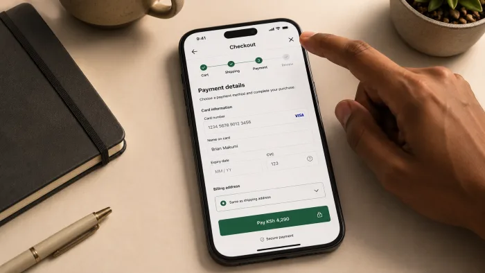
The most expensive place to lose a user is at checkout. Not because the checkout is where the most users leave, but because the checkout is where the user has already decided to pay. They have found your product, understood what it does, decided it is worth the price, and navigated to the payment step. All of that work has been done. And then something in the final moment of the transaction stops them, and they leave.
Most founders attribute checkout abandonment to the wrong causes. The price is too high. The traffic quality is low. The users were never serious. These explanations are sometimes right. They are usually wrong. The more common explanation is simpler and more fixable: the checkout flow has friction. Not one catastrophic failure, but a series of small points of uncertainty, confusion, or inconvenience that accumulate across the flow until a user who was genuinely ready to pay decides, at some specific moment, that it is not worth continuing.
This post is about what that friction looks like, where it tends to accumulate, and how to find the specific point in your checkout where users are leaving so you can fix the right thing rather than guessing.
The most expensive user to lose is the one who had already decided to pay. Checkout abandonment is not a demand problem. It is a friction problem. And friction is findable and fixable.
WHY CHECKOUT FRICTION IS HARD TO SEE FROM INSIDE
The people who build a product test its checkout the same way they test everything else: with full knowledge of how it works, what each step requires, and what comes next. They complete the checkout in under a minute, find it perfectly clear, and conclude that it works.
The user who abandons does not have that knowledge. They encounter each step for the first time, under real conditions, with real uncertainty about whether they can trust the product with their payment details, whether the next step will be what they expect, and whether the commitment they are about to make is reversible if something goes wrong.
Every moment of uncertainty in a checkout flow is a moment where the user is weighing whether to continue or stop. Most of the time they continue. But the accumulation of small uncertainties, each one individually tolerable, eventually tips the balance. The user who abandons at the payment details step did not abandon because of the payment details step. They abandoned because of everything that came before it, and the payment details step was simply the moment where the accumulated friction exceeded their tolerance.
This is why fixing checkout abandonment by changing only the last visible step rarely works. The friction that caused the abandonment started earlier. Finding it requires looking at the whole flow, not just the exit point.
WHERE CHECKOUT FRICTION MOST COMMONLY LIVES
Forced account creation before purchase
Requiring a user to create an account before they can pay is one of the highest-friction points in any checkout flow, and one of the most common. From the product side, it makes sense: you want user data, you want to build a relationship, you want the user in your system. From the user side, it is a demand for commitment before the transaction is complete.
A user who arrived to make a single purchase is now being asked to choose a password, confirm an email address, and agree to terms before they can pay. Each of those steps is a potential exit point, and the combination of them introduces enough delay and uncertainty that a meaningful percentage of users who were ready to pay will not complete the process.
The fix is guest checkout: allow the user to complete the purchase without creating an account, and offer account creation as an optional step after the transaction is confirmed. The user who just had a good purchase experience is more likely to create an account than the user who is being asked to create one before they have received any value.
Unexpected costs at the final step
A user who has navigated through product selection, quantity confirmation, and shipping details has built a mental model of what they are about to pay. When they reach the final payment step and find a number that is different from the one they were expecting, the trust that accumulated across the earlier steps is disrupted.
Shipping costs, taxes, processing fees, and currency conversion charges that appear for the first time at the payment step are not just financially surprising. They are psychologically disruptive. The user now has to recalculate whether the purchase still makes sense at the new price, which introduces decision-making into a step that should require no decisions at all.
The fix is cost transparency as early as possible in the flow. Show the total cost, including all fees and taxes, before the user reaches the payment step. A user who knows the full cost going in is a user who has already made the decision. A user who discovers the full cost at the payment step is a user who has to make the decision again, with less patience than they had at the beginning.
Payment forms that demand unnecessary information
Every field in a payment form is a question the user has to answer under time pressure, on a device that may not be convenient for typing, with the awareness that they are about to hand over financial details. The longer the form, the higher the cognitive and practical cost of completing it.
A payment form that asks for billing address, shipping address, phone number, date of birth, and a security question in addition to card details is a payment form that has not been designed with the user in mind. Some of that information may be required for compliance or fraud prevention. Some of it is collected out of habit rather than necessity. The fields that are not strictly required for the transaction to complete should not be in the form.
The discipline is to audit every field in the payment form and ask whether the transaction fails without it. If the answer is no, the field has a cost without a commensurate benefit, and removing it will improve conversion without affecting the business outcome the field was supposed to serve.
Every field in a payment form is a question asked of a user who is already committed to paying. The ones that are not strictly necessary are friction in disguise.
Unclear security signals
A user about to enter card details is making a trust decision. They are evaluating whether your product is a legitimate business that will handle their financial information responsibly. The visual signals that communicate that legitimacy, SSL indicators, recognised payment provider logos, clear privacy statements, a professional and consistent design, are not decoration. They are the evidence the user is looking at while making the trust decision.
A checkout page that is visually inconsistent with the rest of the product, that does not display recognisable payment security indicators, or that asks for financial information in a way that feels informal or incomplete, is a checkout page that fails the trust evaluation for a subset of users who would otherwise have completed the purchase.
The fix is not adding a badge that says "secure checkout" and assuming the problem is solved. It is auditing the checkout from the perspective of a user who is encountering it for the first time and asking what evidence they have that this is a safe and legitimate transaction. Every gap in that evidence is a gap in the trust signal that costs conversion.
No clear path back or forward
A user who reaches the payment step and realises they need to change something from an earlier step, the shipping address, the quantity, the selected variant, needs a clear and reliable way to go back without losing the progress they have made. A checkout flow that clears the cart or loses entered information on back navigation is a checkout flow that punishes the user for exercising normal browsing behaviour.
Equally, a checkout flow that does not communicate clearly what happens after the user submits payment is a flow that introduces uncertainty at the moment of commitment. Does the order confirm immediately? Will there be an email? How long does fulfilment take? A user who does not know what comes next is a user who is less certain about whether to proceed, which is the opposite of what the final step of a purchase should feel like.
HOW TO FIND EXACTLY WHERE YOU ARE LOSING PEOPLE
Set up funnel tracking
The most direct way to find checkout drop-off is to configure a conversion funnel in your analytics tool that tracks users through each step of the checkout process as a sequence of events. Step one: user reaches the cart. Step two: user begins checkout. Step three: user reaches payment details. Step four: user completes purchase.
The funnel report shows you what percentage of users who entered each step completed it and moved to the next. The step with the largest drop-off percentage is the step with the most friction. That is where to start.
If your analytics is not currently configured to track this, setting it up is a one-time investment that pays back immediately in the specificity it gives you. General site analytics tells you that users are leaving the checkout. Funnel tracking tells you exactly where.
Look at time spent on each step
A step where users spend significantly longer than expected is a step where they are encountering friction they are trying to work through rather than abandoning immediately. High time-on-step with high completion is a step that is difficult but users are managing. High time-on-step with high drop-off is a step that is difficult enough that users are giving up after trying.
Both are worth fixing, but the second one is more urgent. A step that users abandon after spending time on it is a step where the friction is high enough to overcome the commitment the user had already built. That is the most expensive kind of friction because it occurs so late in the process.
Check for rage clicks and form errors
If you have session recording or heatmap tools configured, look for rage click patterns in the checkout flow. Repeated clicks on the same element indicate that the element is not behaving the way the user expects, whether that is a button that does not appear to respond, a field that is rejecting input without explanation, or a navigation element that is not working as expected.
Form error rates are equally informative. A field that generates a high rate of validation errors is a field where the requirements are not being communicated clearly enough for users to satisfy them on the first attempt. Each error is a friction point that introduces delay, frustration, and an additional decision about whether to continue.
Survey users who abandoned
Analytics tells you where users are leaving. It does not tell you why. For that, the most direct tool is an exit survey: a brief, optional prompt shown to users who navigate away from the checkout without completing it, asking a single question about why they left.
The responses to that question, even a small sample of them, are often more revealing than weeks of analytics review. A user who types "I could not figure out which address to enter for billing" is telling you something specific that no conversion funnel can surface. The friction points that users can articulate in their own words are the ones most worth addressing immediately.
THE FIX IS USUALLY SMALLER THAN YOU THINK
Most checkout abandonment problems, once identified specifically, are not expensive to fix. Removing a required account creation step is a product decision that can be implemented in a sprint. Moving the cost disclosure to an earlier step in the flow is a design change. Reducing the number of fields in the payment form is an afternoon of work. Improving the security signals on the checkout page is a design review.
What makes checkout friction expensive is not the cost of fixing it. It is the cost of not finding it, which accumulates with every user who was ready to pay and did not. The diagnostic work described in this post, setting up funnel tracking, reviewing time on step, checking error rates, running an exit survey, is a one-time investment that identifies the specific friction points worth addressing and eliminates the guesswork that most checkout optimisation efforts are built on.
The user who abandons your checkout was already your customer. Getting them back is not a marketing problem. It is a friction problem with a specific location and a specific fix. Finding that location is the work that everything else depends on.
CLOSING THOUGHT
A checkout flow that loses users at the last moment is not a broken product. It is a product with specific, findable, fixable friction at a specific point in a specific step. The founders who fix it fastest are the ones who look at the data before assuming they know the cause. The data almost always points somewhere more specific than intuition does, and the fix at that specific point is almost always smaller and faster than the rebuild that a vague sense of checkout problems tends to produce.
If your checkout is losing users and you are not sure where or why, that is exactly the kind of problem I can help you find and fix. Tell me about your product and what you are seeing in the numbers.